Flutter 有着丰富的布局控件库 .
Flutter 中的布局整体分为
- Single-child layout widget (单子布局部件)
- Multi-child layout widget (多子布局部件)
本篇我们将开始学习单子布局部件 .
类似于 Android 学习中有五大布局, 可是到实际开发中 , 用到的最多的只有线性布局、相对布局、帧布局. Flutter 布局单子部件官网学习文档列就有 18 种 , 在实际开发中未必能全用到 . 为了节省学习成本 , 各位童鞋可先重点掌握一二 , 其余浅尝辄止即可 . 先有个简单的了解认识 , 待后期有适合的应用场景时再深入挖掘 😐
为了更好的阅读体验 , 请点击 阅读原文 :)
Container(重点)
Container Widget 即容器 , 是一个常用的部件 . 官方对其定义如下 :
一个方便的小部件 , 它结合了常见的对小部件的绘制、定位和确定大小
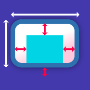
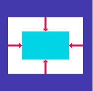
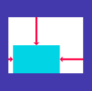
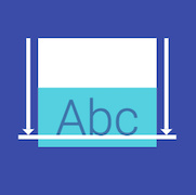
一个 Container 首先有padding围绕着子部件 (图中深绿色部分) , 将宽高作为约束 . 然后 container 被额外的空白控件围绕, 叫做 margin.
其绘制顺序大致为:
- 先应用给定的变换 transform
- 然后绘制 decoration
- 再绘制子部件 child
- 最后绘制 foregroundDecoration
transform 是指对widget在原有基础上做一些类似旋转、平移之类的变换 . decoration 以及 foregroundDecoration 是部件的 背景/前景 ‘装饰’ , 比如绘制部件的边框,背景图片等都是 decoration 和 foregroundDecoration中设置的 .下面我们用一段代码来说明:
1
2
3
4
5
6
7
8
9
10
11
12
13
14
15
16
17
18
19
20
21
22
23
24
25
26
27
28
29
30
| class DemoContainer extends StatelessWidget {
@override
Widget build(BuildContext context) {
var imgUrl = "https://ws1.sinaimg.cn/large/006tNc79gy1fpa5bvsqskj3044048mx5.jpg";
return new Container(
padding: const EdgeInsets.all(16.0),
color: new Color(0xFFF2F2F2),
alignment: Alignment.center,
child: new Container(
width: 400.0,
height: 400.0,
padding: const EdgeInsets.all(16.0),
alignment: Alignment.center,
decoration: new BoxDecoration(
color: Colors.blueGrey,
border: new Border.all(
color: Colors.blue,
width: 8.0,
),
image: new DecorationImage(image: new NetworkImage(imgUrl))
),
child: new Text('Halcyon',style: const TextStyle(color: Colors.blue,fontSize: 24.0),),
)
);
}
}
|
效果图 :
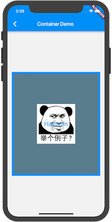
首先导航栏下面整个是一个内边距padding 16 的灰色(#F2F2F2)背景的Container , 其唯一子部件是居中对齐的 . 然后我们主要说明的就是这个子部件 , 同样是个Container . 这个子 Container 宽高均为400 , 也设置了内边距 padding 16 (不过图中没有表现出来) .其 decoration 设置为拥有四周宽度为8的蓝色边框 . 并且有一个表情包图片作为容器背景 , 由于没指定图片拉伸方式 , 此时图片以原始大小居中显示 . 同时这个容器拥有一个内容为 ‘Halcyon’ 的文本子控件居中 .
由于以上提及的 Container 绘制顺序 , Container是先绘制 decoration , 再child ,再绘制 foregroundDecoration , 如若我们将代码中的 decoration 换成 foregroundDecoration , ‘Halcyon’ Text文本就会被 ‘前景装饰’ 中设置的图片覆盖了, 不可见.
布局行为
布局行为这个类似 Android 里View的 MeasureSpec 问题 . 可以先简单过一遍 , 等真正使用时, 结合实际例子进行理解.
Container 布局行为顺序:
- 遵从 aligment
- 根据 子部件 child 确认自身大小
- 遵从 width , height , constraints
- 扩展以填充父部件
- 尽可能的小
没有子部件的 Container 会尽可能的大 , 除非传入的约束是无界的 , 这种情况它会尽可能的小 . 有子部件的 Container 根据子部件来确定大小 , 通过构造函数传入的 width , height 还有约束会将其覆盖 .
当然这段话理解起来有点模糊 . 我们来说的具体点 .
以下为 Container 各种情况下的大小
1. 若其无子部件 , 无宽高 , 没有约束 . 父部件提供了无界的约束 . Container将尽可能的小 .
eg:
1
2
3
4
5
6
7
8
| @override
Widget build(BuildContext context) {
return new UnconstrainedBox(
child: new Container(
color: Colors.blue,
)
);
}
|
此时 Container将小到不可见
2. 若其无子部件 , 无排列 , 但是有宽高或者约束 , Container 将会在给定约束及父部件的约束结合下尽可能的小.
eg:
1
2
3
4
5
6
7
8
9
10
11
| @override
Widget build(BuildContext context) {
return new ConstrainedBox(
constraints: new BoxConstraints(maxHeight: 50.0,minWidth: 200.0),
child: new Container(
width: 100.0,
height: 100.0,
color: Colors.blue,
)
);
}
|
此时 Container宽50高200
3. 若其无子部件 , 无宽高 , 没有约束 , 没有排列 , 但是父部件提供了有界约束 . Container将会扩展至适应父部件提供的约束.
eg:
1
2
3
4
5
6
7
8
9
| @override
Widget build(BuildContext context) {
return new ConstrainedBox(
constraints: new BoxConstraints(maxHeight: 50.0,maxWidth: 50.0),
child: new Container(
color: Colors.blue,
)
);
}
|
此时 Container宽高50
4. 若其有 alignment , 还有父部件提供的无界约束 . Container会确认自身大小与子部件接近
eg:
1
2
3
4
5
6
7
8
9
10
11
12
13
| @override
Widget build(BuildContext context) {
return new UnconstrainedBox(
child: new Container(
color: Colors.blue,
alignment: Alignment.center,
child: new Container(
width: 50.0,
height: 50.0,
)
)
);
}
|
此时 Container 与子Container同大小.
5. 若其有 alignment , 还有父部件提供的有界约束 . Container会尝试去扩展以适应父部件 , 然后按照对齐方式放置子部件.
6. 若其有子部件 , 但是无宽高 ,约束 以及对齐方式 , 那么 Container 将约束从父部件传递给子部件,并将自身大小与子部件匹配
Padding
可给子部件内嵌边距padding的部件
与 Container 容器设置 padding 属性无太大差别.
eg:
1
2
3
4
5
6
7
8
9
10
11
12
| @override
Widget build(BuildContext context) {
return
new Container(
color: Colors.blueGrey,
child: new Padding(
padding: new EdgeInsets.all(16.0),
child: const Card(color: Colors.white, child: const Text('halcyon'),
),
),
);
}
|
Center
置子部件居中的部件
eg:
1
2
3
4
5
6
7
8
9
10
11
12
13
14
15
16
17
18
| @override
Widget build(BuildContext context) {
return new Container(
width: 300.0,
height: 300.0,
color: Colors.grey,
child: new Center(
widthFactor: 1.0,
heightFactor: 1.0,
child: new Container(
child: const Text('Center Words'),
color: Colors.lightBlue,
),
),
);
}
|
Align
在内部对齐子部件的部件, 根据子部件大小决定自身大小
1
2
3
4
5
6
7
8
9
| @override
Widget build(BuildContext context) {
return new Center(
child: new Align(
alignment: Alignment.centerRight,
child: const Text('Halcyon',style: const TextStyle(color: Colors.blue ,fontSize: 24.0),),
),
);
}
|
‘Halcyon’文本位于父部件中右方
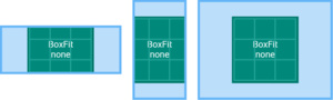
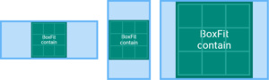
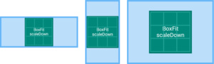
FittedBox
根据 BoxFit 对子部件拉伸及定位
BoxFit.none
对齐目标盒子中的元素 (默认居中) , 然后丢弃盒外的元素.
图片元素不会被拉伸.
BoxFit.contain
尽可能地大,同时包含完整的目标盒子
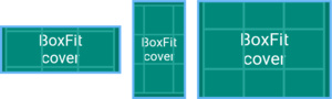
BoxFit.cover
尽可能地小,但仍覆盖目标盒子
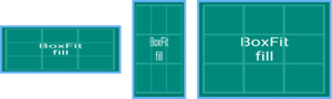
BoxFit.fill
比例拉伸以填充目标盒子
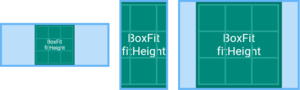
BoxFit.fitHeight
确保显示目标的全部高度,忽视横向是否显示完整
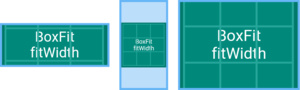
BoxFit.fitWidth
确保显示目标的全部宽度,忽视纵向是否显示完整
scaleDown
对其目标(默认居中),如果需要,则会缩放目标使其在盒子内
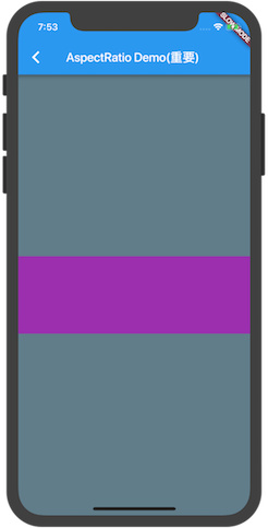
AspectRatio(重点)
尝试给子部件指定比例确认大小.
eg:
1
2
3
4
5
6
7
8
9
10
11
12
| @override
Widget build(BuildContext context) {
return new Container(
color: Colors.blueGrey,
alignment: Alignment.center,
child: new AspectRatio(
aspectRatio: 3.0 / 1.0,
child: new Container(
color: Colors.purple,
),)
);
}
|
代码中所示为 Container1 > AspectRatio > Container2 的布局层次 , AspectRatio布局指定了子布局宽高比属性 aspectRatio 为 3.0 / 1.0 , 又因为未指定部件大小 , 部件默认填充父部件 , 因此 Container2 宽为屏幕宽度 , 高为宽的 1/3 .
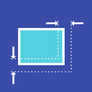
ConstraintedBox(重点)
用以给子部件添加额外约束. 比如可以给子部件添加一个最低高度50像素
eg:
1
2
3
4
5
6
7
8
9
10
11
12
| @override
Widget build(BuildContext context) {
return new Container(
color: Colors.blueGrey,
alignment: Alignment.center,
child: new ConstrainedBox(
constraints: new BoxConstraints(minHeight: 100.0,maxHeight: 300.0,minWidth: 100.0,maxWidth: 300.0),
child: const Card(child: const Text('Halcyon Days',
style: const TextStyle(color: Colors.teal, fontSize: 24.0)),),
),
);
}
|
代码示例中 , 我们给予 Card部件添加了一个最小宽/高度100.0 , 最大宽/高度300.0 . 当 ‘ Halcyon Days ‘ 文本变化时,其宽高始终在 [100,300] 的中变化 .
Baseline
顾名思义 , 就是根据子部件基线进行定位.
FractionallySizedBox(重点)
百分比布局
eg:
1
2
3
4
5
6
7
8
9
10
11
12
13
14
| @override
Widget build(BuildContext context) {
return new Container(
color: Colors.blueGrey,
alignment: Alignment.center,
child: new FractionallySizedBox(
widthFactor: 0.5,
heightFactor: 0.5,
child: new Container(
color: Colors.teal,
),
),
);
}
|
代码示例中 Container1 > FractionallySizedBox > Container2 . Container2 宽高均为 Container1 的一半
IntrinsicHeight
当高度不受限制时, 我们希望子部件保持一个合理的高度而不是去尝试无限扩张 , 这个时候我们可以用 IntrinsicHeight ,不过这个类消耗较多 , 不建议使用
IntrinsicWidth
当宽度不受限制时, 我们希望子部件保持一个合理的宽度而不是去尝试无限扩张 , 这个时候我们可以用 IntrinsicWidth ,不过这个类消耗较多 , 不建议使用
LimitedBox
当不受约束时限制大小
Offstage
在其中的子部件不会被绘制,也不会占用空间.当offstage 属性为false时将会渲染子部件
eg:
1
2
3
4
5
6
7
8
9
10
11
12
13
14
15
16
17
18
19
20
21
22
| @override
Widget build(BuildContext context) {
return new Column(
children: <Widget>[
new Container(
height: 200.0,
color: Colors.grey,
),
new Offstage(
offstage: true,
child: new Container(
height: 100.0,
color: Colors.pink,
),
),
new Container(
height: 100.0,
color: Colors.teal,
)
],
);
}
|

以上示例 , 当 offstage 为 true时(默认), Offstage部件及其子部件将不会绘制, 类似Android 中给View设置Visibility为View.GONE一样; 而 offstage 为 false时, 将会绘制
OverflowBox
OverflowBox会给子部件施加一个与其自身从父部件直接获取的不同的约束,可能会使得其溢出父部件
SizedBox
有着明确尺寸的盒模型
SizedOverflowBox
有着明确尺寸的盒模型,但是会传递原始约束给子部件,可能会溢出
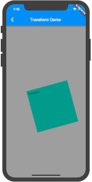
Transform在绘制子部件之前将应用变换效果
eg:
1
2
3
4
5
6
7
8
9
10
11
12
13
14
15
16
17
18
| @override
Widget build(BuildContext context) {
return new Container(
color: Colors.grey,
alignment: Alignment.center,
child: new Transform(
alignment: Alignment.topRight,
transform: new Matrix4.rotationZ(50.0),
child: new Container(
padding: const EdgeInsets.all(8.0),
height: 200.0,
width: 200.0,
color: Colors.teal,
child: const Text('halcyon'),
),
),
);
}
|
CustomSingleChildLayout(重点)